UX DESIGN / WEB DESIGN
Muddy Waters Bar and Grill
Small Business, Restaurant Website
Designing a website experience to increase online satisfaction in customers and showcasing the unique attributes of a small town restaurant.
OVERVIEW
Develop a fully functioning website prototype in desktop layout for a restaurant. The focus of the redesign is to allow targeted users to explore menus and lists of events easily and cohesively.
THE TASK
The site needs to use copy content from the site or from the location’s online content, but students can generate new branding. Existing images can be used or new-found photography. Consider target use cases, branding, ambiance and interactivity.
SOLUTION
Designing a website experience to increase online satisfaction in target customers, focusing on the menu and approachability of the visual branding. Showcasing the unique attributes of Muddy Waters Bar and Grill as a go-to establishment of downtown Prescott, WI.
BACKGROUND
COMPETITIVE ANALYSIS RESEARCH
To start, I analyzed three competitive resources to better understand the industry space. This includes other businesses in the area that target similar customers and companies that I think preform well online.
How can I promote user exploration with information in an intuitive way?
How can I create a cohesive composition throughout the whole site?
Three businesses that I researched were:
- Philander's Bar and Grill
- Milwaukee Burger Company
- Two Rivers Lodge Bar and Grill
PHILANDER'S BAR AND GRILL
MILWAUKEE BURGER CO.
TWO RIVERS LODGE BAR AND GRILL
Direct competitor to Muddy Waters, also located in downtown Prescott, WI.
Direct competitor to Muddy Waters, also located in downtown Prescott, WI.
Larger chain, similar food to Muddy Waters.
- Known for their cheese-curds and burgers, also sells alcohol
- Doesn't feel local -> due to larger chain business
- Least upscale aesthetic out of all 3 competitors, sports focused. The small town version of a Buffalo Wild Wings aesthetic.
- Small business that sells essentially the same food and alcohol
- Small business that sells essentially the same food and alcohol as well as featuring live music
- More “rustic” aesthetic, not as fancy or upscale as Muddy Waters
My main finding was that the local competitors had all the helpful information for users, but their website presence was bland and outdated. Milwaukee Burger Company had the most modern website and the most user friendly.
For Muddy Waters I saw the opportunity to combine a modern, minimal visual design that also translated into a simple user experience and embraced the local small-town community.
USER RESEARCH & PERSONAS
I wanted to learn more about what user's current experiences were like on the Muddy Waters site. I set different goals a user might have when visiting the site and evaluated how easy or difficult it was to accomplish the goal.
My summarized experiences:
Browsing the Menu - The menu option is in the header (text color changes very subtly on mouse hover). When clicked, redirected to a new tab with two buttons ("Lunch Menu" and "Dinner Menu"). When a menu option is clicked, redirected to another tab with a PDF menu.
More Information about the Restaurant - Click on the "Backwaters" option in the header (text color changes very subtly on mouse hover). When clicked, redirected to a new tab with a photo carousel of images of the outside of the restaurant from different angles. The only text is small headings on top of the pictures.
View Live Music Schedule - Click on the “BANDS 2022” option in the header (text color changes very subtly on mouse hover). When clicked, redirected to a new tab with a scrollable list of the bands for 2022. *Band schedule is outdated.
I then created a user persona based on my research to inform my site design and ultimately, user testing.
DAN METZGER
BIO
VALUES & GOALS
CHALLENGES
Dan is a retired military member that spends his time with his family and riding around the midwest on motorcycle trips with his friends.
Dan values hard work and dedication with a passion for traveling and community. He has lived a good life and wants to spend his time relaxing and with family.
Age 63 / Retired Military
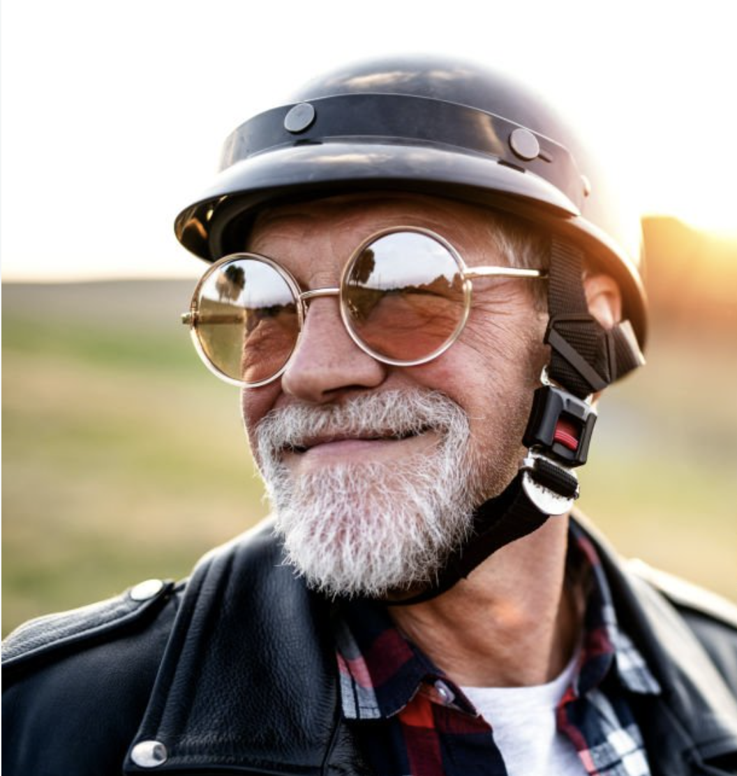
Dan sometimes struggles with technology as it is rapidly changing. He is uncomfortable with using social media and often communicates via calling on his cell phone.
What a cool guy!
A very common challenge in today's world
IDEATION & DESIGN
After developing an understanding of users, I created a site map to show hierarchy, group content, and decide what pages or content blocks will feature what content. Due to the scope of the project, the sitemap is not very extensive as I was limited to what content was already present on the site.
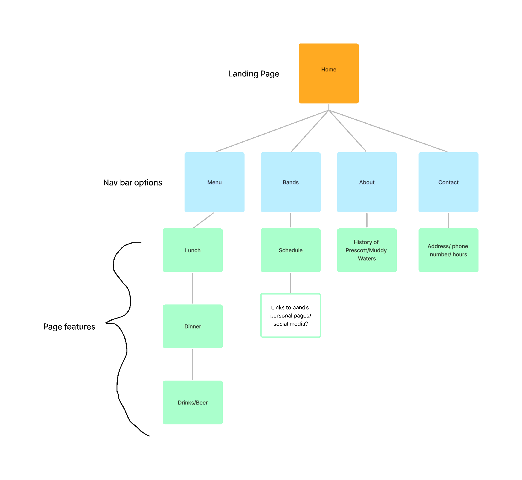
SITEMAP
WIREFRAMES
With a site map plan, I developed two wireframes of the landing page to start planning out visual design.
BRANDING
After moving forward with a Lo-fi prototype based on my wireframes to test functionality and usability, I created three different visual design directions with style guides.
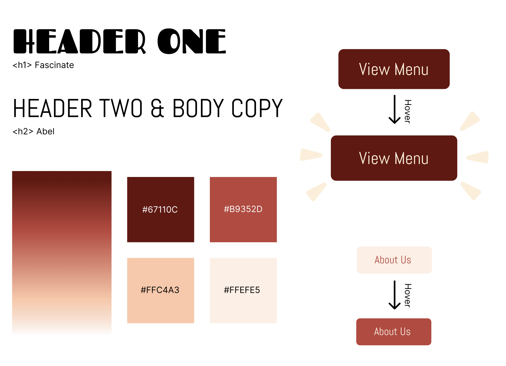
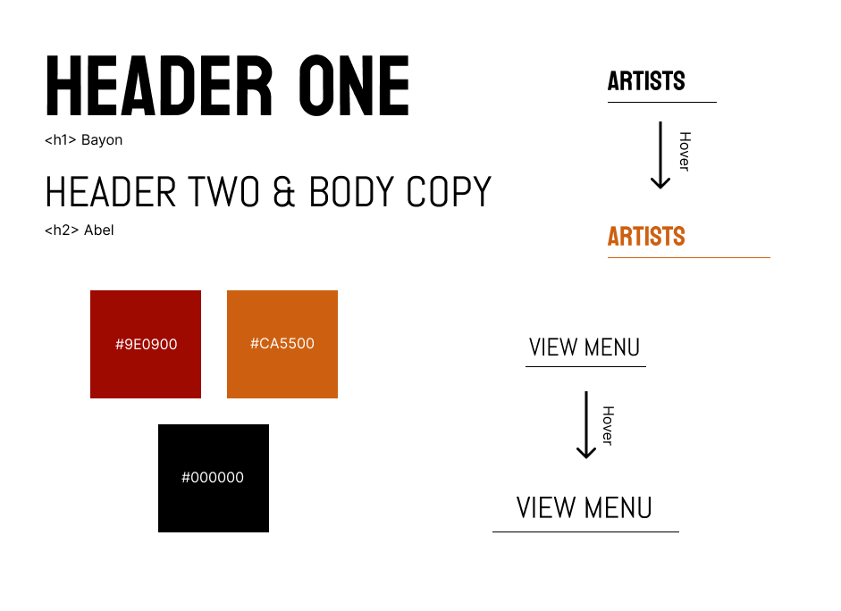
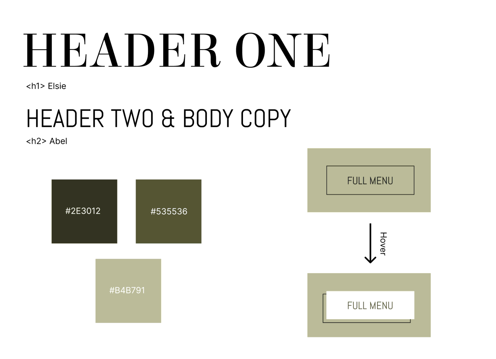
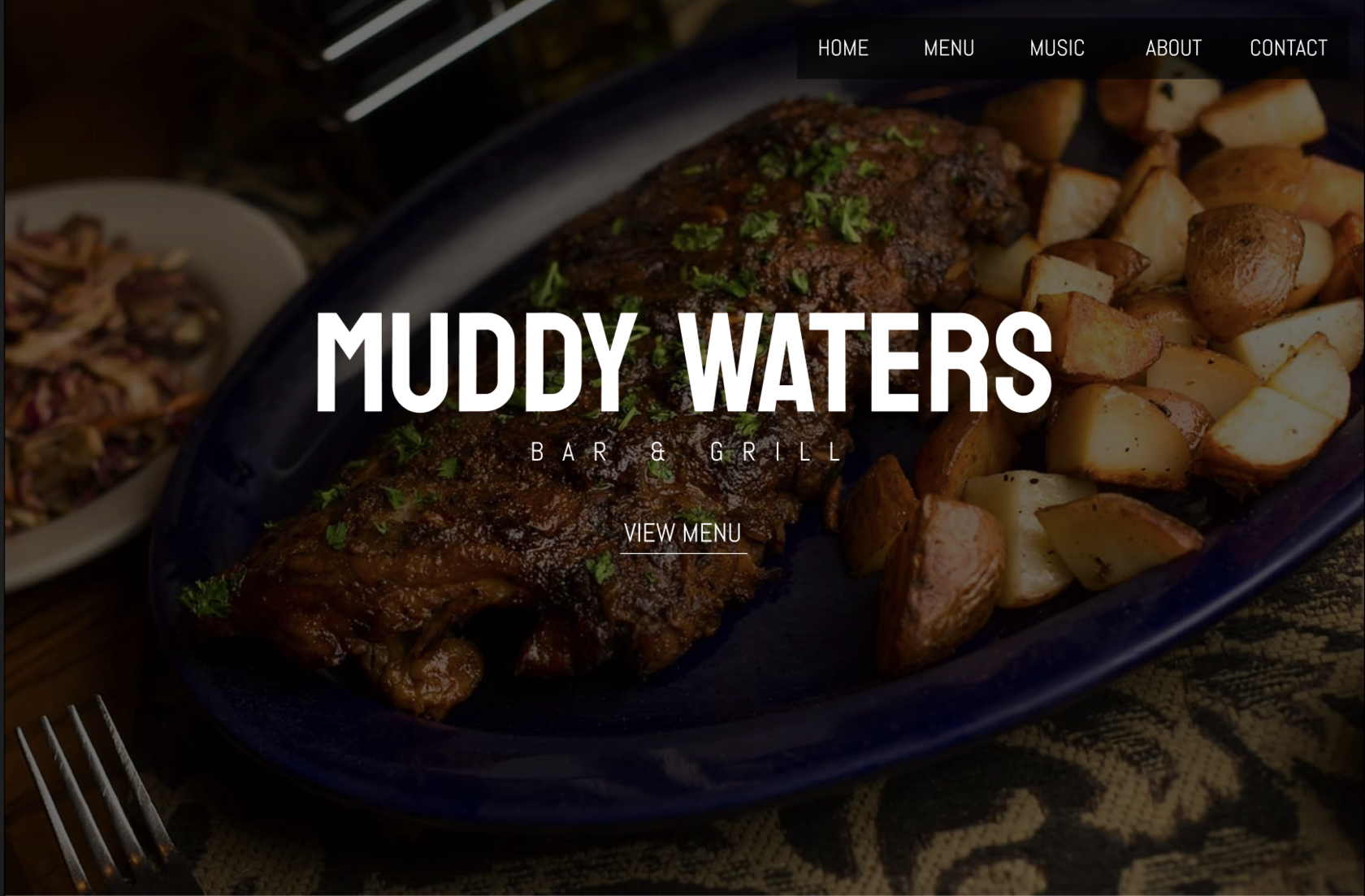
Final chosen visual design!
FINAL VISUALS & PROTOTYPES
PROTOTYPE
